Setting Backgrounds & Gradients
Adding a Background Colo
The quickest way to add a background to an element is to add a single-color background using the background or background-color property. The background property accepts colors and images in shorthand form, while the background-color property is used strictly for setting solid background colors.
div {
background-color: #b2b2b2;
}
Transparent Backgrounds
we can use two background-color properties within a single rule set. The first background-color property will use a “safe” background color, such as a hexadecimal value, and the second background-color property will use an RGBa or HSLa value
div {
  background-color: #b2b2b2;
  background-color: rgba(0, 0, 0, .3);
}
Adding a Background Image
The url() function value will be the background image’s path, and the familiar rules for creating hyperlink paths apply here. Keep an eye out for different directories, and be sure to show exactly where the image resides. The path will be placed inside parentheses and quoted.
div {
  background-image: url("alert.png");
}
by default the background image will repeat horizontally and vertically from the top left of the given element to fill up the element’s background.
Background Repeat
The background-repeat property accepts four different values: repeat, repeat-x, repeat-y, and no-repeat. The repeat value is the default value and will repeat a background image both vertically and horizontally.
div {
  background-image: url("alert.png");
  background-repeat: no-repeat;
}
Background Position
By default, background images are positioned at the left top corner of an element. However, by using the background-position property, we can control exactly where the background image is placed relative to that corner.
div {
  background-image: url("alert.png");
  background-position: 20px 10px;
  background-repeat: no-repeat;
}
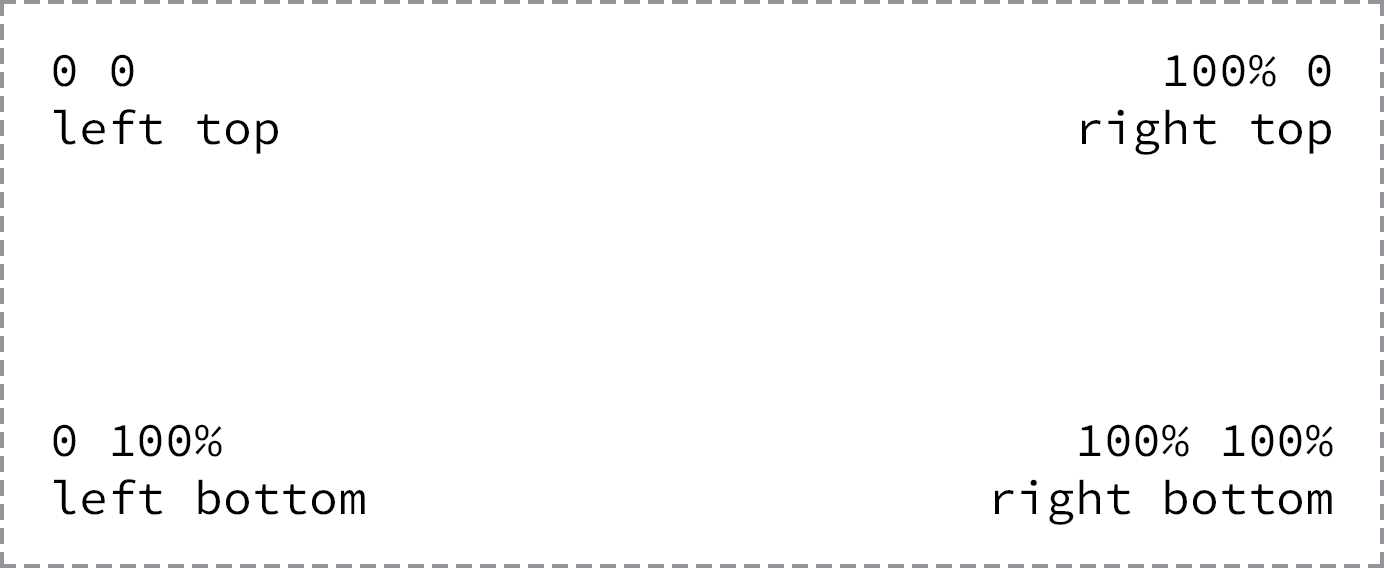
The background-position property requires two values: a horizontal offset (the first value) and a vertical offset (the second value). If only one value is specified, that value is used for the horizontal offset and the vertical offset will default to 50%.
To set a background-position value, we can use the top, right, bottom, and left keywords, pixels, percentages, or any length measurement. Keywords and percentages work very similarly. The keyword value left top is identical to the percentage value 0 0, which will keep an image positioned at the left top corner of the element. The keyword value right bottom is identical to the percentage value 100% 100%, which will position an image in the right bottom corner of the element.
Shorthand Background Image Values
The background-color, background-image, background-position, and background-repeat properties may be rolled up into a shorthand value for the background property alone. The order of these properties as a shorthand background property value may vary, however it commonly falls as background-color, background-image, background-position, and then background-repeat.
div {
  background: #b2b2b2 url("alert.png") 20px 10px no-repeat;
}
Designing Gradient Backgrounds
Within CSS, gradient backgrounds are treated as background images. We can create a gradient using the background or background-image properties, just like a regular background image. The property value for a gradient background varies depending on what type of gradient we’d like, linear or radial.
Changing the Direction of a Gradient Background
By default, linear gradient backgrounds move from the top to the bottom of an element, transitioning smoothly between the first color value and the second. This direction, however, may be changed with the use of keywords or a degree value stated before any color values.
For example, should we want a gradient to move from the left of an element to the right, we can use the keyword value to right to identify the direction in which the linear gradient should progress. Keyword values may also be combined. If we want the gradient to move from the left top to the right bottom of an element, we can use the keyword value of to right bottom.
div {
  background: #466368;
  background: linear-gradient(to right bottom, #648880, #293f50);
}
Radial Gradient Background
While the linear gradient is perfect for a gradient moving from one direction to another, often the need for a radial gradient arises. Radial background gradients work just like linear gradients and share many of the same values. For radial gradients, instead of using the linear-gradient() function within the background or background-image property, we’ll use the radial-gradient() function.
div {
  background: #466368;
  background: radial-gradient(#648880, #293f50);
}
Radial gradients work from the inside to the outside of an element. Thus, the first color identified within the radial-gradient() function will sit in the absolute center of the element, and the second color will sit on the outside of an element.
Gradient Color Stops
At a minimum, gradient backgrounds will transition from one color to another; however, we may add multiple colors to a gradient and have the browser transition between all of them. To do this we’ll add color stops to the given gradient function, with commas separating each color stop from the next.
div {
  background: #648880;
  background: linear-gradient(to right, #f6f1d3, #648880, #293f50);
}
By default, the browser will position every color stop an equal distance from the next and will transition between them accordingly. If more control over how colors are positioned is desired, a location along the gradient may be identified for each color stop. The location should be declared as a length value and should fall after the color value.
div {
  background: #648880;
  background: linear-gradient(to right, #f6f1d3, #648880 85%, #293f50);
}
Exploring New Background Properties
.
The background-size property allows us to change the size of a background image, while the background-clip and background-origin properties allow us to control where a background image is cropped and where a background image is contained within the element (inside the border or inside the padding, for example).
CSS3 Background Size
The background-size property allows us to specify a size for a background image. The property accepts a few different values, including length and keyword values.
When using length values, we can specify a width and a height value by using two space-separated values. The first value will set the width of the background image, while the second value will set the height of the background image. It’s important to note that percentage values are in relation to the element’s size, not the background image’s original size.
Consequently, setting a background-size property with a 100% width will make the background image occupy the full width of the element. If a second value isn’t identified after the width, the height value will be automatically set to preserve the aspect ratio of the background image.
div {
  background: url("shay.jpg") 0 0 no-repeat;
  background-size: auto 75%;
  border: 2px dashed #9799a7;
  height: 240px;
  width: 200px;
}
Cover & Contain Keyword Values
The cover keyword value specifies that the background image will be resized to completely cover an element’s width and height. The background image’s original aspect ratio will be preserved, yet the image will stretch or shrink as necessary to cover the entire element. Often when using the cover keyword value, part of the background image is cut off in order for the image to occupy the full available space of the element.
The contain keyword value, on the other hand, specifies that the background image will be resized to reside entirely contained within an element’s width and height. In doing so the background image’s original aspect ratio will be preserved, but the image will stretch or shrink as necessary to remain within the width and height of the element. In contrast with the cover keyword value, the contain keyword value will always show the full background image; however, oftentimes it will not occupy the full available space of the element.
CSS3 Background Clip & Background Origin
The background-clip property specifies the surface area a background image will cover, and the background-origin property specifies where the background-position should originate. The introduction of these two new properties corresponds with the introduction of three new keyword values: border-box, padding-box, and content-box. Each of these three values may be used for the background-clip and background-origin properties.
div {
  background: url("shay.jpg") 0 0 no-repeat;
  background-clip: padding-box;
  background-origin: border-box;
}
The background-clip property value is set to border-box by default, allowing a background image to extend into the same area as any border. Meanwhile, the background-origin property value is set to padding-box by default, allowing the beginning of a background image to extend into the padding of an element