How Are Elements Displayed?
block-level elements occupy any available width, regardless of their content, and begin on a new line. Inline-level elements occupy only the width their content requires and line up on the same line, one after the other. Block-level elements are generally used for larger pieces of content, such as headings and structural elements. Inline-level elements are generally used for smaller pieces of content, such as a few words selected to be bold or italicized
Display
Exactly how elements are displayed—as block-level elements, inline elements, or something else—is determined by the display property. Every element has a default display property value; however, as with all other property values, that value may be overwritten. There are quite a few values for the display property, but the most common are block, inline, inline-block, and none.
The Space Between Inline-Block Elements
One important distinction with inline-block elements is that they are not always touching, or displayed directly against one another. Usually a small space will exist between two inline-block elements. This space, though perhaps annoying, is normal.
What Is the Box Model?
According to the box model concept, every element on a page is a rectangular box and may have width, height, padding, borders, and margins.
That’s worth repeating: Every element on a page is a rectangular box.
According to the box model, the total width of an element can be calculated using the following formula:
margin-right + border-right + padding-right + width + padding-left + border-left + margin-left
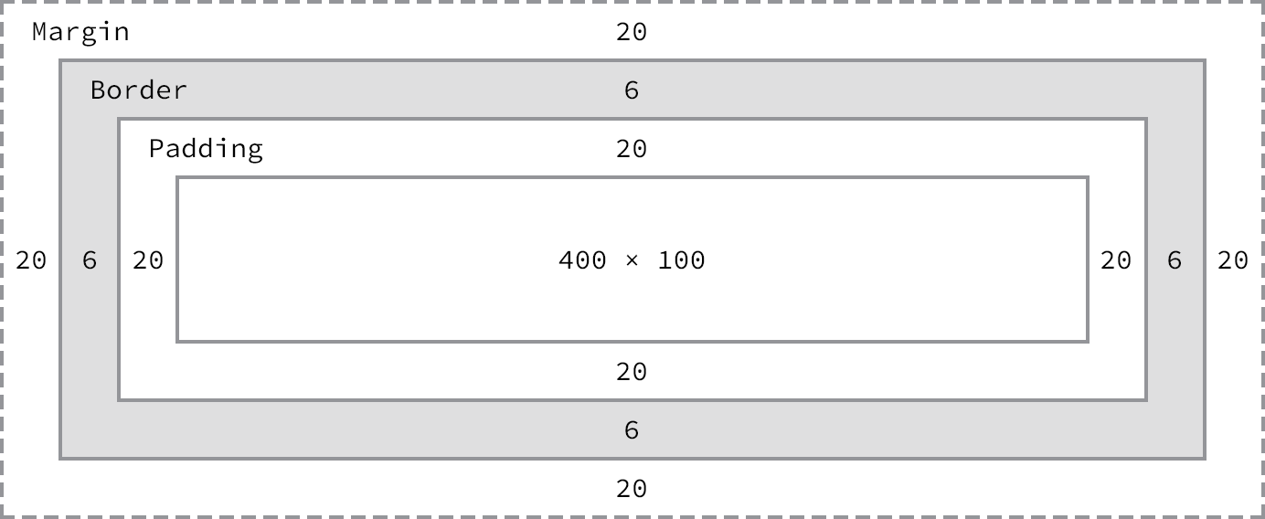
Using the formulas, we can find the total height and width of our example code.
Width: 492px = 20px + 6px + 20px + 400px + 20px + 6px + 20px
Height: 192px = 20px + 6px + 20px + 100px + 20px + 6px + 20px
The box model is without question one of the more confusing parts of HTML and CSS. We set a width property value of 400 pixels, but the actual width of our element is 492 pixels. By default the box model is additive; thus to determine the actual size of a box we need to take into account padding, borders, and margins for all four sides of the box
Width
The default width of an element depends on its display value. Block-level elements have a default width of 100%, consuming the entire horizontal space available. Inline and inline-block elements expand and contract horizontally to accommodate their content. Inline-level elements cannot have a fixed size, thus the width and height properties are only relevant to non-inline elements. To set a specific width for a non-inline element, use the width property:
div {
  width: 400px;
}
Height
The default height of an element is determined by its content. An element will expand and contract vertically as necessary to accommodate its content. To set a specific height for a non-inline element, use the height property:
div {
  height: 100px;
}
Sizing Inline-Level Elements
Please keep in mind that inline-level elements will not accept the width and height properties or any values tied to them. Block and inline-block elements will, however, accept the width and height properties and their corresponding values.
Margin
The margin property allows us to set the amount of space that surrounds an element. Margins for an element fall outside of any border and are completely transparent in color. Margins can be used to help position elements in a particular place on a page or to provide breathing room, keeping all other elements a safe distance away. Here’s the margin property in action:
div {
  margin: 20px;
}
One oddity with the margin property is that vertical margins, top and bottom, are not accepted by inline-level elements. These vertical margins are, however, accepted by block-level and inline-block elements.
Padding
The padding property is very similar to the margin property; however, it falls inside of an element’s border, should an element have a border. The padding property is used to provide spacing directly within an element. Here’s the code:
div {
  padding: 20px;
}
The padding property, unlike the margin property, works vertically on inline-level elements. This vertical padding may blend into the line above or below the given element, but it will be displayed.
Margin & Padding on Inline-Level Elements
Inline-level elements are affected a bit differently than block and inline-block elements when it comes to margins and padding. Margins only work horizontally—left and right—on inline-level elements. Padding works on all four sides of inline-level elements; however, the vertical padding—the top and bottom—may bleed into the lines above and below an element.
Margins and padding work like normal for block and inline-block elements.
Margin & Padding Declarations
padding: 10px 20px 30px;
top: 10; bottom: 30px; left/right: 20px
Margin & Padding Colors
The margin and padding properties are completely transparent and do not accept any color values. Being transparent, though, they show the background colors of relative elements. For margins, we see the background color of the parent element, and for padding, we see the background color of the element the padding is applied to.
Borders
The border property requires three values: width, style, and color. Shorthand values for the border property are stated in that order—width, style, color. In longhand, these three values can be broken up into the border-width, border-style, and border-color properties.
Border Radius
A single value will round all four corners of an element equally; two values will round the top-left/bottom-right and top-right/bottom-left corners in that order; four values will round the top-left, top-right, bottom-right, and bottom-left corners in that order.
Box Sizing
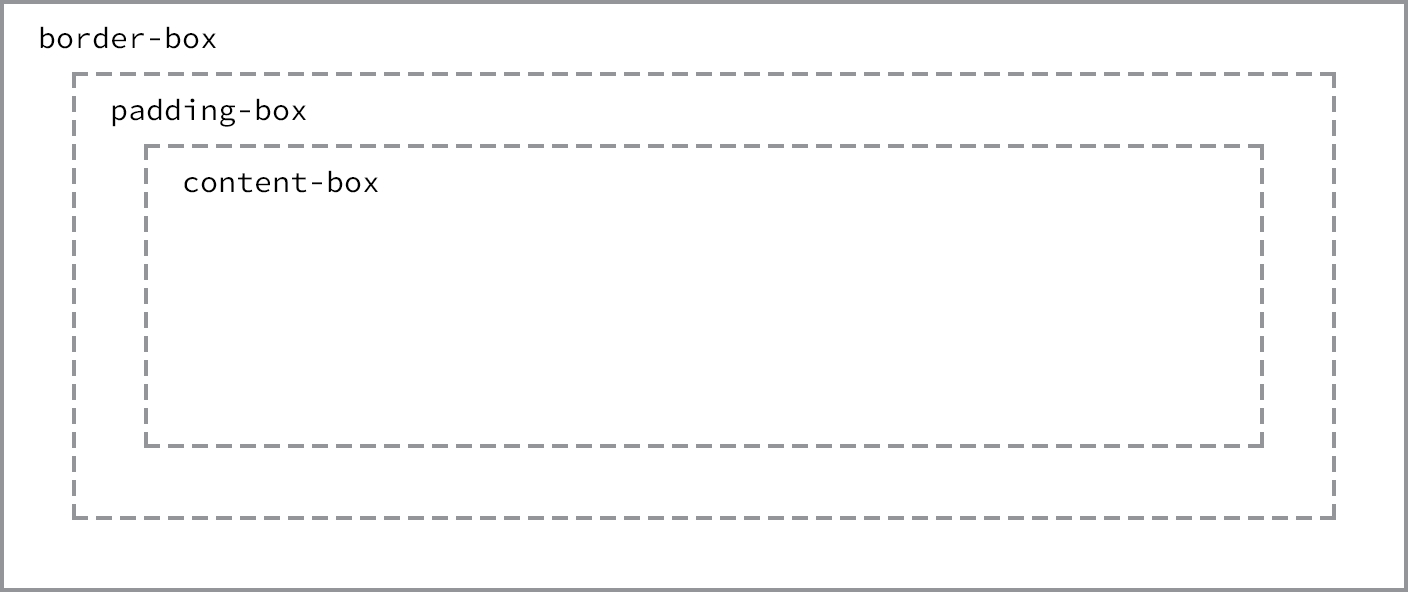
The box model may, however, be changed to support different calculations. CSS3 introduced the box-sizing property, which allows us to change exactly how the box model works and how an element’s size is calculated. The property accepts three primary values—content-box, padding-box, and border-box—each of which has a slightly different impact on how the box size is calculated.
Content Box
The content-box value is the default value, leaving the box model as an additive design. If we don’t use the box-sizing property, this will be the default value for all elements. The size of an element begins with the width and height properties, and then any padding, border, or margin property values are added on from there.
div {
  -webkit-box-sizing: content-box;
     -moz-box-sizing: content-box;
          box-sizing: content-box;
}
Border Box
the border-box value alters the box model so that any border or padding property values are included within the width and height of an element. When using the border-box value, if an element has a width of 400 pixels, a padding of 20 pixels around every side, and a border of 10 pixels around every side, the actual width will remain 400 pixels.
If we add a margin, those values will need to be added to calculate the full box size. No matter which box-sizing property value is used, any margin values will need to be added to calculate the full size of the element.
div {
  box-sizing: border-box;
}
Picking a Box Size
Generally speaking, the best box-sizing value to use is border-box. The border-box value makes our math much, much easier. If we want an element to be 400 pixels wide, it is, and it will remain 400 pixels wide no matter what padding or border values we add to it.
The only drawback to using the box-sizing property is that as part of the CSS3 specification, it isn’t supported in every browser; it especially lacks support in older browsers. Fortunately this is becoming less and less relevant as new browsers are released.